Posts

Final Portfolio

Image
 Coming into this class, FMX 210, I had absolutely no clue how to use any kind of Adobe software. I have always been a Mac user, so I barely even know how to use the features that Word offers. With every project, came a little bit more experience. Throughout the semester I started to appreciate how every one of the platforms we were learning to use built on each other. There are similar tools and concepts used to construct projects in each platform. Honestly, I did not really think that I would be using any of this information in the future, but I have found myself 3 times now using what I have learned in this class with Photoshop in order to do work for my other classes and it has served me very well. I actually enjoyed (part of) putting this project together because it forced me to go back and look at projects I did from the beginning of the semester to now, and I liked being able to really see how little I knew about Adobe software to the last project and being fairly familiar with

Business Cards

Image
I created my own logo to put on my business cards to reflect my brand identity and serve as a symbol of my personal "brand" . The design of the cards is minimal istic , with a neat and symmetrical aesthetic . The cards feature my logo , contact information , and other personal information . My cards are a great way for me to make a positive first impression and help others get to know me better . This project was fun because I liked being able to go to the past and take work I have done from another project (my personal logo) and implement it in a different way for this project.

Postcard

Image
  For this project we were to create a postcard using InDesign. I chose to use images of Tampa because that is where I consider to be my home for now . Through my project , I ’ ve tried to capture the beauty and vib ran cy of this city . I used Adobe In Design to bring together a range of elements such as fonts , colours , and pictures that show the unique character of Tampa . I wanted to show how much I enjoy living here and how much I appreciate its culture and its people . It is my hope that this post card will inspire others to explore the city through the photos i used

Animation

Image
  This animation is an exploration in motion and color . The motion of the basketball as it moves through space and time is a representation of energy as it is released resulting in a graceful culmination as the basketball finds its home in the hoop . The colors used in the animation work in concert with the motion of the ball , creating a visual sym phony of movement and vib ran cy . The project was very difficult to figure out where to position each part of the image and how many frames to use etc... but once I got the hang of it I could figure out where everything needed to be.

InDesign

 Video 1:  https://youtu.be/RXRT3dHu6_o This video is a very long and in-depth video to help begenners learn to use the platform. Something that might be hard to learn to use is its complex "object - oriented workflow" , which can make it hard if you are new to the program . On the other hand , something interesting about In Design is its ability to work with other Adobe applications like Photoshop and Illust rator , which makes it a great choice for experienced graphic designers . Video 2: https://youtu.be/7VpAisbfldI Some of the more complex tasks , such as creating specific page layouts or working with master pages , can take some time to learn . However , the learning curve seems to be worth it as In Design can be used to create very professional print documents or PDF s . One of the most interesting features of In Design is its ability to integrate with other Adobe

Somewhere

Image
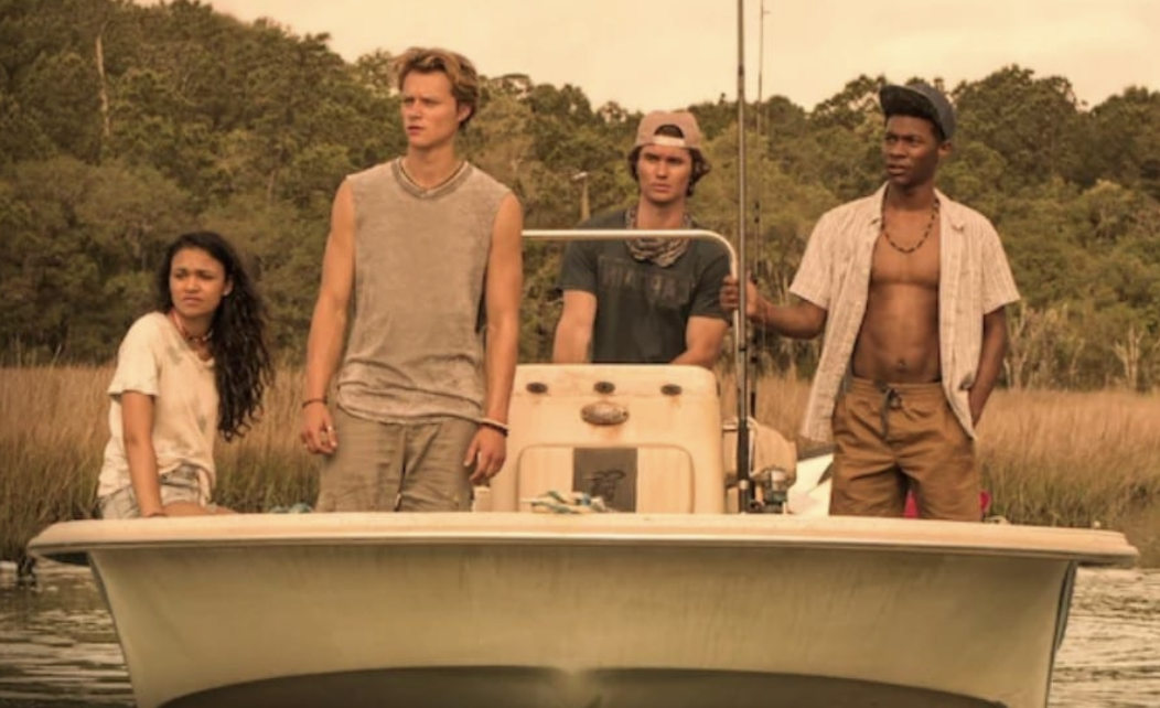
  When assigned to place myself into a scene of a movie/show using adobe photoshop, this was almost an immediate and easy decision to do the show "Outer Banks" . I have always loved this show and felt very connected with the characters and their lifestyle in the movie because I have spent a lot of time throughout my life in the OBX. Placing myself into this scene felt natural for me because I am always happiest at the beach or by the water and with my friends and this is exactly the vibe of the scene shot that I used for this project. 

pre-somewhere blog

Image
 I think of all the images, this one would be the most complex to photoshop myself in because of the very small hairs that are around their heads from the blanket. The very tiny details are what would be difficult.  This image is so great for the ":somewhere" project because this is such an iconic destination and a very classic background for photoshop images and projects like this.  I thought this picture was funny but it looks very difficult to photoshop back to the original.  I thought this is so cool because it would be so hard to get a photo like the on the top because if our current day in age so to be able to get that photo is really cool